Friday, April 30, 2010
Tuesday, April 27, 2010
Decode Poster Design (In Progress)

 Two versions of a poster I'm currently designing for my Form and Communication II class. It's a poster design for a digital art exhibition in London called Decode: Digital Design Sensations
ACL Music Fest Cover Sleeve (for Z Fold)
 This is the cover sleeve to go onto the Z Fold book below. It is also a work in progress.
Progress on my ACL Music Fest Z Fold
 This is a project for my Typography II class where we were given copy text to incorporate into a grid structure of our choice. The entire Z Fold will fold down into a 4" by 5" booklet with a cover about the ACL Music Festival. This is a work in progress.
Conte Still Life
 Here is a Conte still life that I created in a drawing class. I set up a still life based on research of the Vietnam War.
Cubism Exploration in Drawing
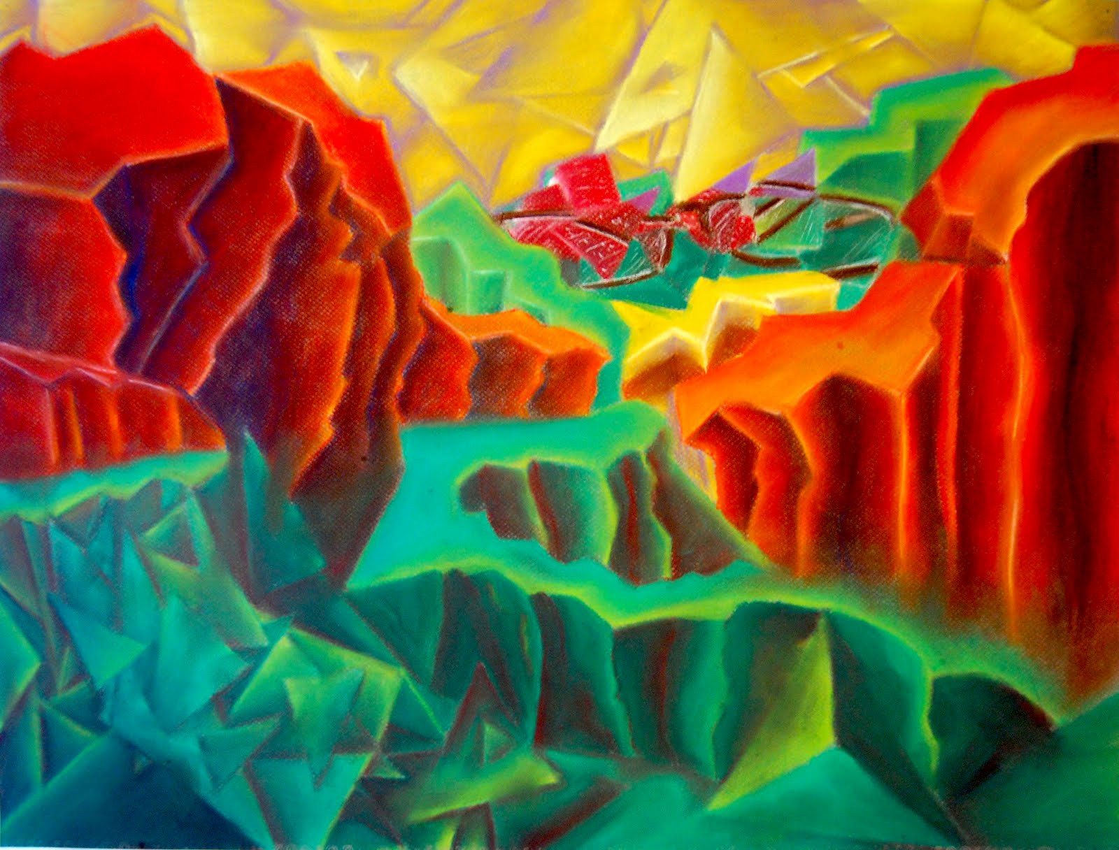 This is an exploration of Cubism done in Drawing II of freshman year. Done in pastel, it is an interpretation of a drawing of objects I arranged as a scene.
Jackdriver
 This was a half and half assignment from a Design class. We had to combine to images to create a new concept off of juxtaposition.
K
 Also in Design II of freshman year, we had to take pictures of the ABC's in nature without manipulating object to look like letters. This was my favorite out of the series.
Condom Covered Guitar

 This was a project for my Design II class during freshman year. I never put any of these on my blog, so I thought I would begin to do so now. I wanted to capture the concept of sex and rock.
Figure Drawing

Here is a figure drawing that I did using graphite pencil that was then translated in illustrator. I traced the outlines I had created by hand and then filled in the figure with highlights. I wanted to show a scene of devastation; the figure kind of gave that depressed vibe to me from the angle I was drawing her at.
ACL Band Posters Finalized


This is a series of posters that were designed for my Typography II class. Each poster utilizes a different typographical organization; linear, radial, dialational, random, and grid. The posters were designed for the Austin City Limits music festival with bands of our choice.
Wednesday, March 10, 2010
Bad Typography Inspiration

This could be some of the worst typography I have ever seen. No grids. No Hierarchy. And a mess of type faces and annoying shapes. Ew.
Tuesday, March 9, 2010
Silverware shaped to a...D?

 The upper left photo of the fork bent out of wack is actually a bracelet. I took this as my inspiration for the "Found Object Drop Cap" and applied it to a letter form. I simply bent the spoons, knives, and forks to a jumbled mess of metal. I looked at it for a while and added silverware where I thought it'd be necessary. Eventually, after some struggle with the idea, I got to the finished product...the letter D.
Thursday, February 25, 2010
ACL Band Posters


In Typography II, we were assigned a semester long project where were submit 2 posters a week utilizing diverse typographic systems. Each week we are given a new system to work with a band of our choice. This week I have chosen the political and edgy band, State Radio. I wanted to create two different posters of different meaning. The first poster I wanted to capture the edginess of the band with a tilted linear axis for the type to branch off of. The second poster I created an illustration of Uncle Sam with inspiration from Ralph Steadman. It is created entirely out of a traditional quill pen and India Ink. I wanted to show the political side of the band and they're feelings toward American Politics. For this one, I used a offset linear axis to the left. The images are the rough draft copies and were later refined and edited.
Tuesday, February 16, 2010
Drop Cap of the Week!

The idea of this "Drop Cap of the Week" was first used by Jessica Hische when she began doing Daily Drop Caps. These are letters that she created and posts online for people to see. I love the concept of the Drop Cap and I was extremely excited to begin doing my own! So here's my first drop cap attempt. I didn't do much process because I decided to create it without thumbnails (which we traditionally use for EVERYTHING in class). This was a bit more open so I decided to just allow my hand to move the ink onto the paper and see what happens. It's done in india ink and a quill nib pen. It was fun to do
and just make up without having a clear image in

mind. I've been inspired by Ralph Steadman lately as well as the work of Dan Lisowski, so this is somewhat my experimentation with letters and making them with the styles of those artists. The top left is my work and the bottom left is an ink drawing by Ralph Steadman (one of the many pieces I was inspired by).
Ah! It's too bad too look at!

This is a flyer I discovered while walking to the elevator this evening. It initially grabbed my attention because of the bight red paper it was printed on. As I looked at it more, I found myself wondering why the consistency? Virtually all of the text is bolded and there is a lack of hierarchy. The point of the flyer is to get people to join the a'capella group "The Golden Blues", but the name of the group is hardly legible amongst a flyer that is bold and barely readable. The only thing that truly stands out is the curvature of the headline text, but even that is not a font much larger than the rest to separate it from the rest. The worst part is there is no grid, just centered text that all looks the same. Good flyer huh?
Subscribe to:
Comments (Atom)
