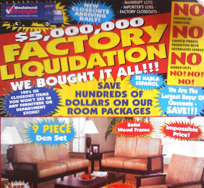
This could be some of the worst typography I have ever seen. No grids. No Hierarchy. And a mess of type faces and annoying shapes. Ew.

 The upper left photo of the fork bent out of wack is actually a bracelet. I took this as my inspiration for the "Found Object Drop Cap" and applied it to a letter form. I simply bent the spoons, knives, and forks to a jumbled mess of metal. I looked at it for a while and added silverware where I thought it'd be necessary. Eventually, after some struggle with the idea, I got to the finished product...the letter D.
